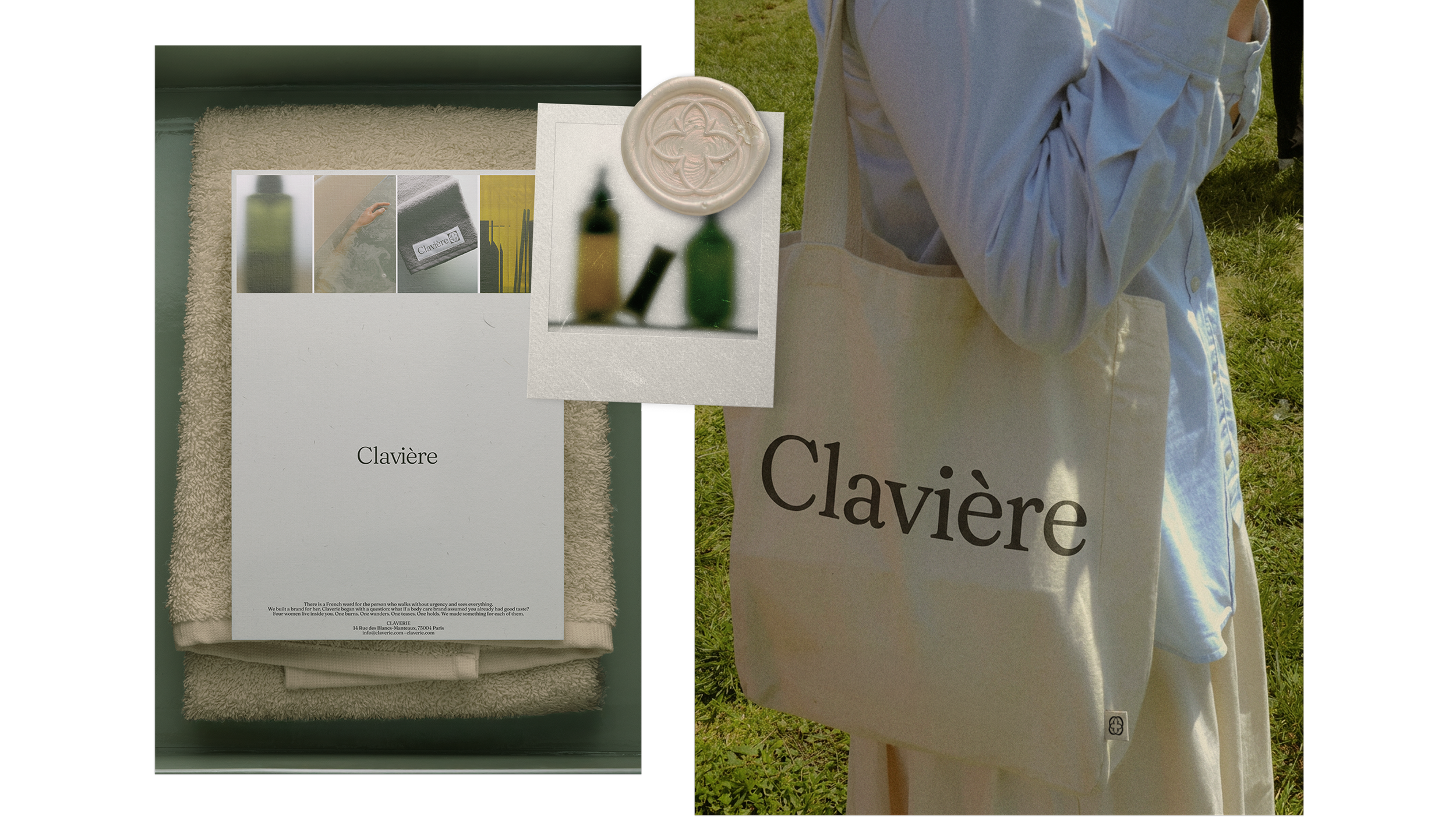
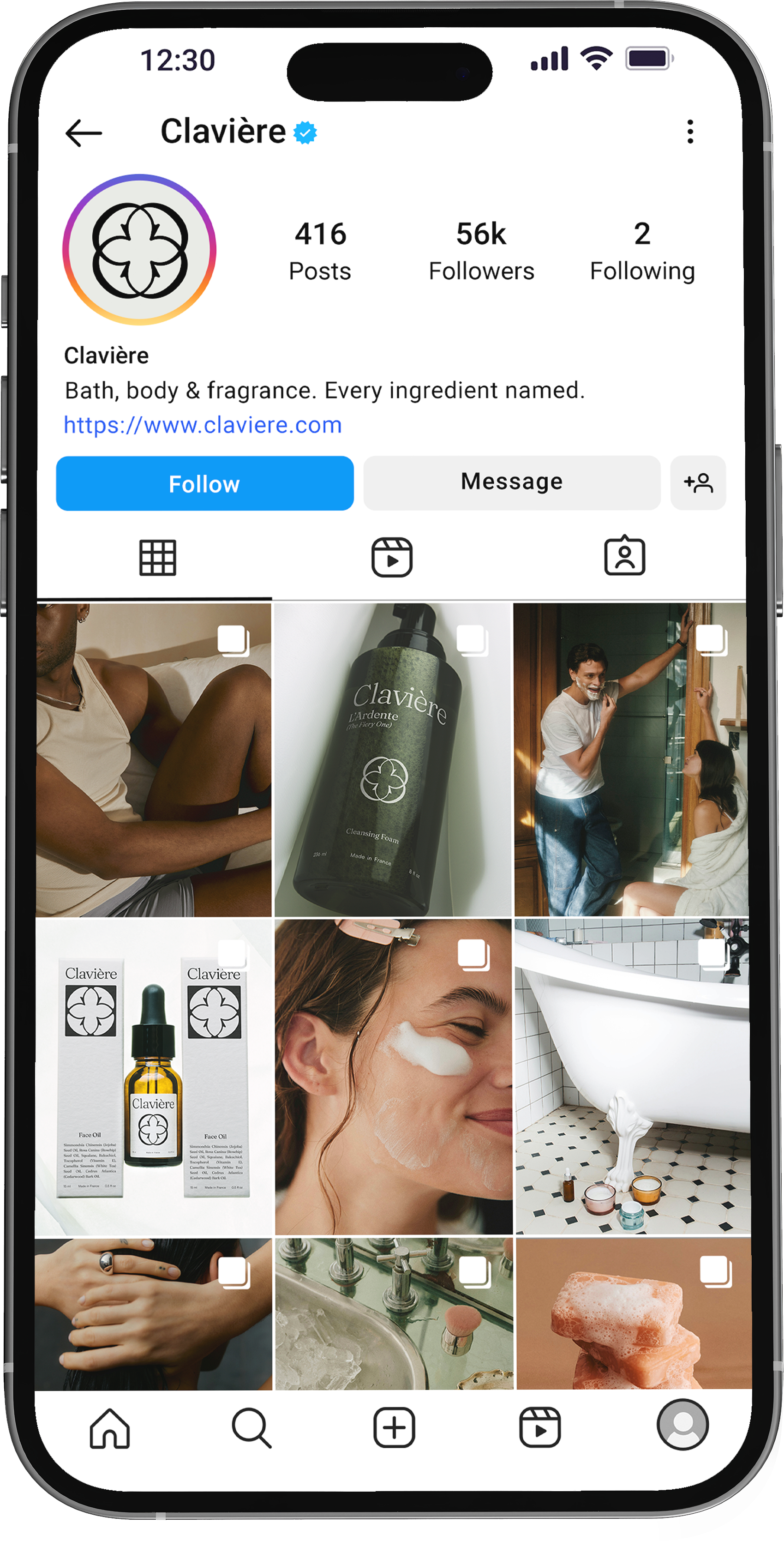
BRAND IDENTITY
Clavière
A self-directed luxury brand identity exploring restraint, ingredient transparency, and character-driven product architecture.
CONTEXT
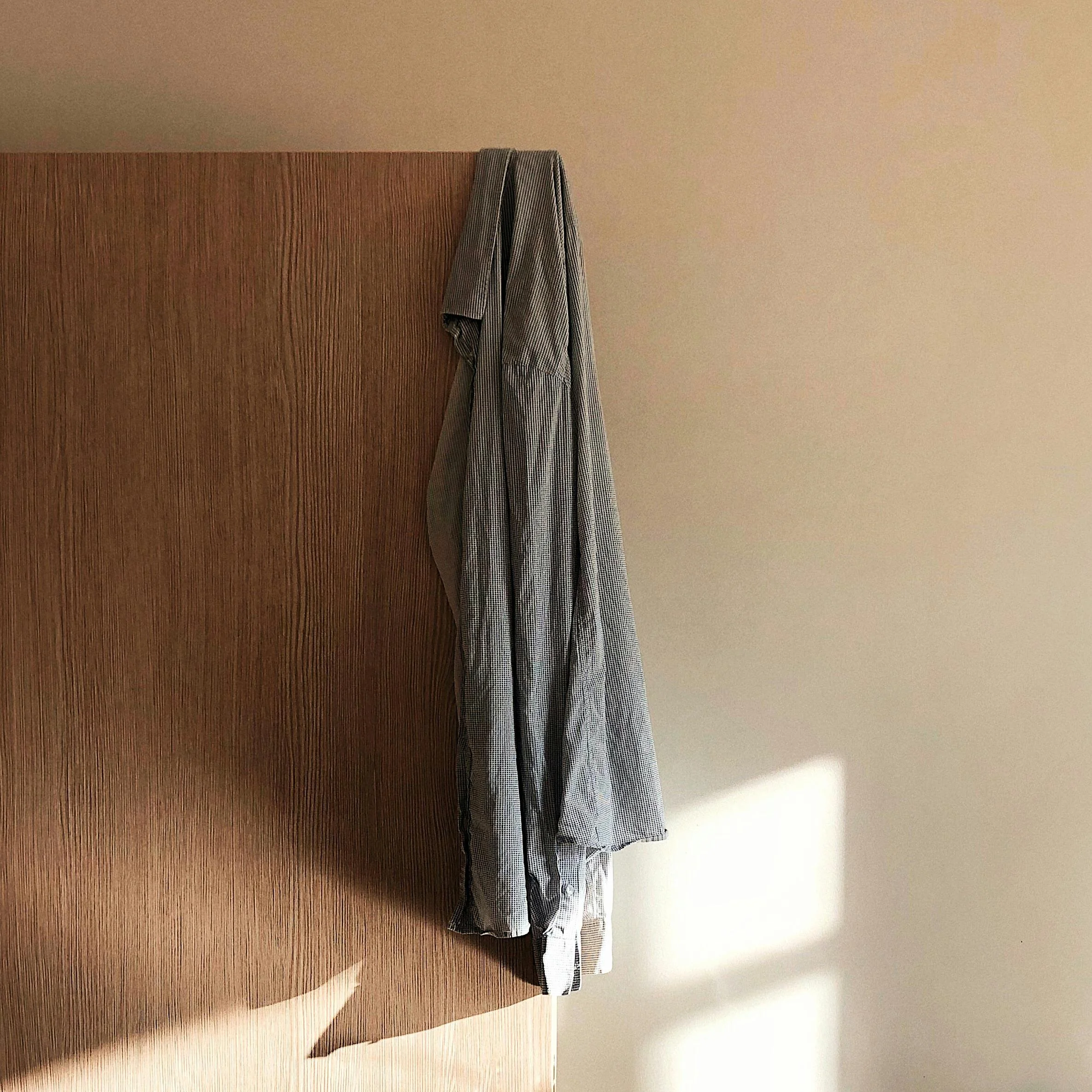
This project was also a deliberate stretch in range. My professional work often skews bold and colorful. Clavière let me practice intentionally working with restraint, premium positioning, and typographic systems at the same level.
I set myself a brief: design a brand that could architect a higher price-point, pairing a French-inspired identity with full ingredient disclosure.
Role: Brand Strategy · Naming · Identity Design · Packaging · Copywriting
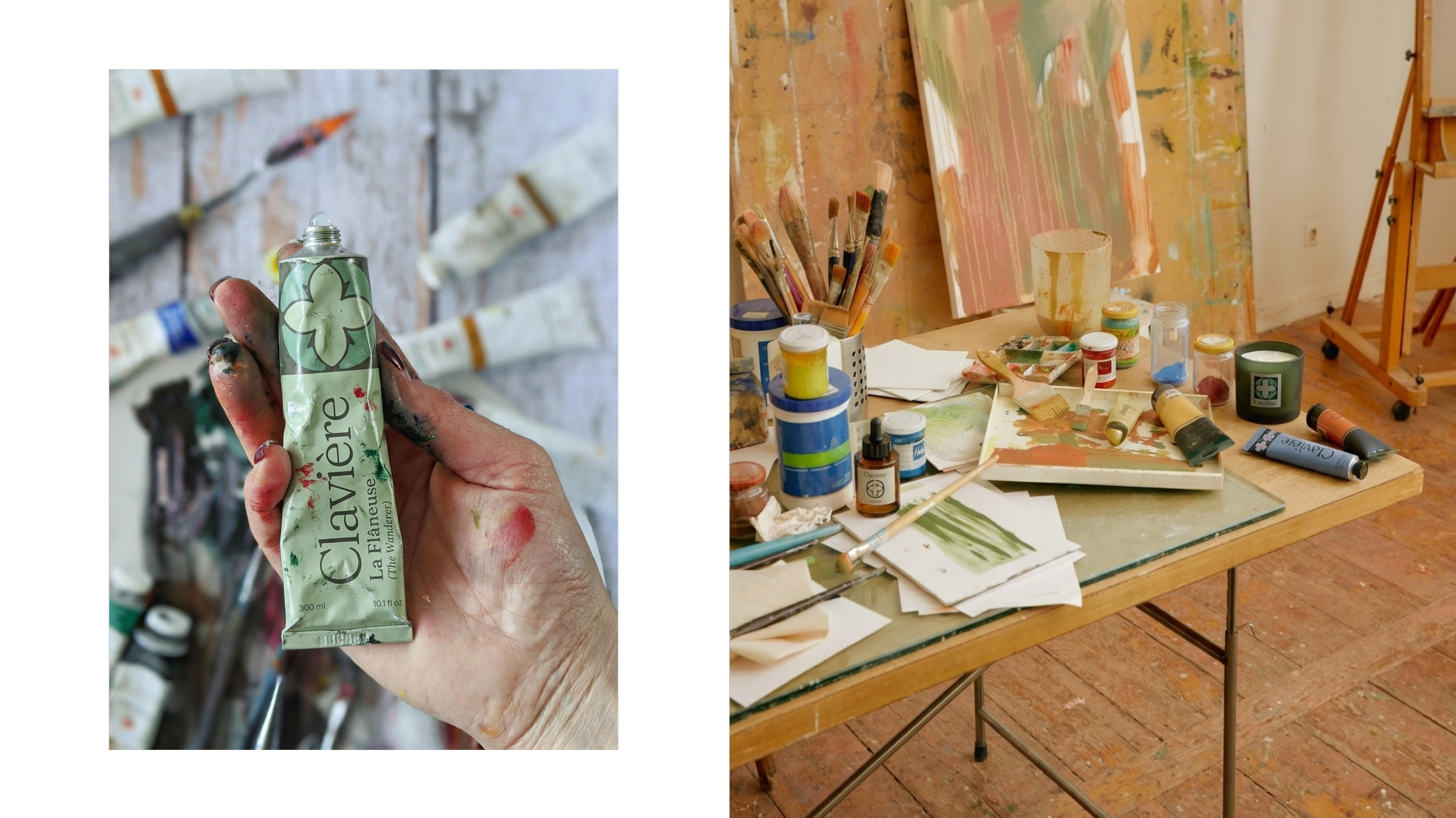
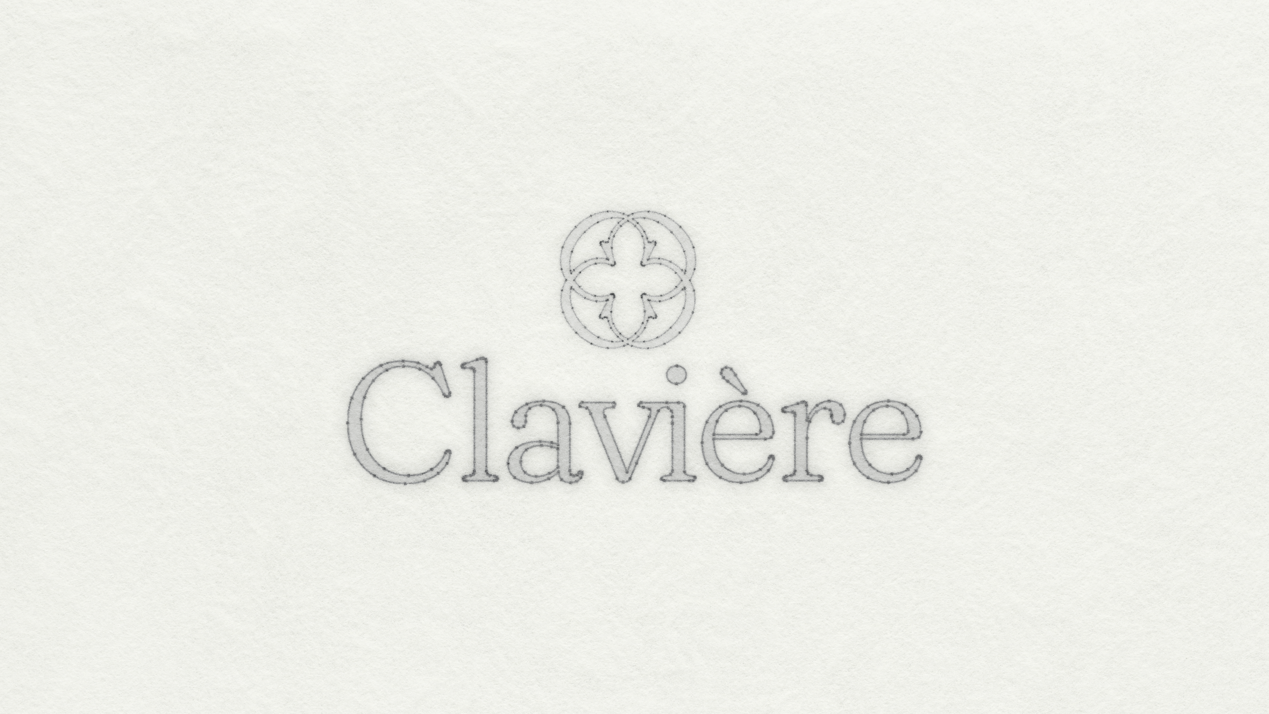
LOGO + MARK

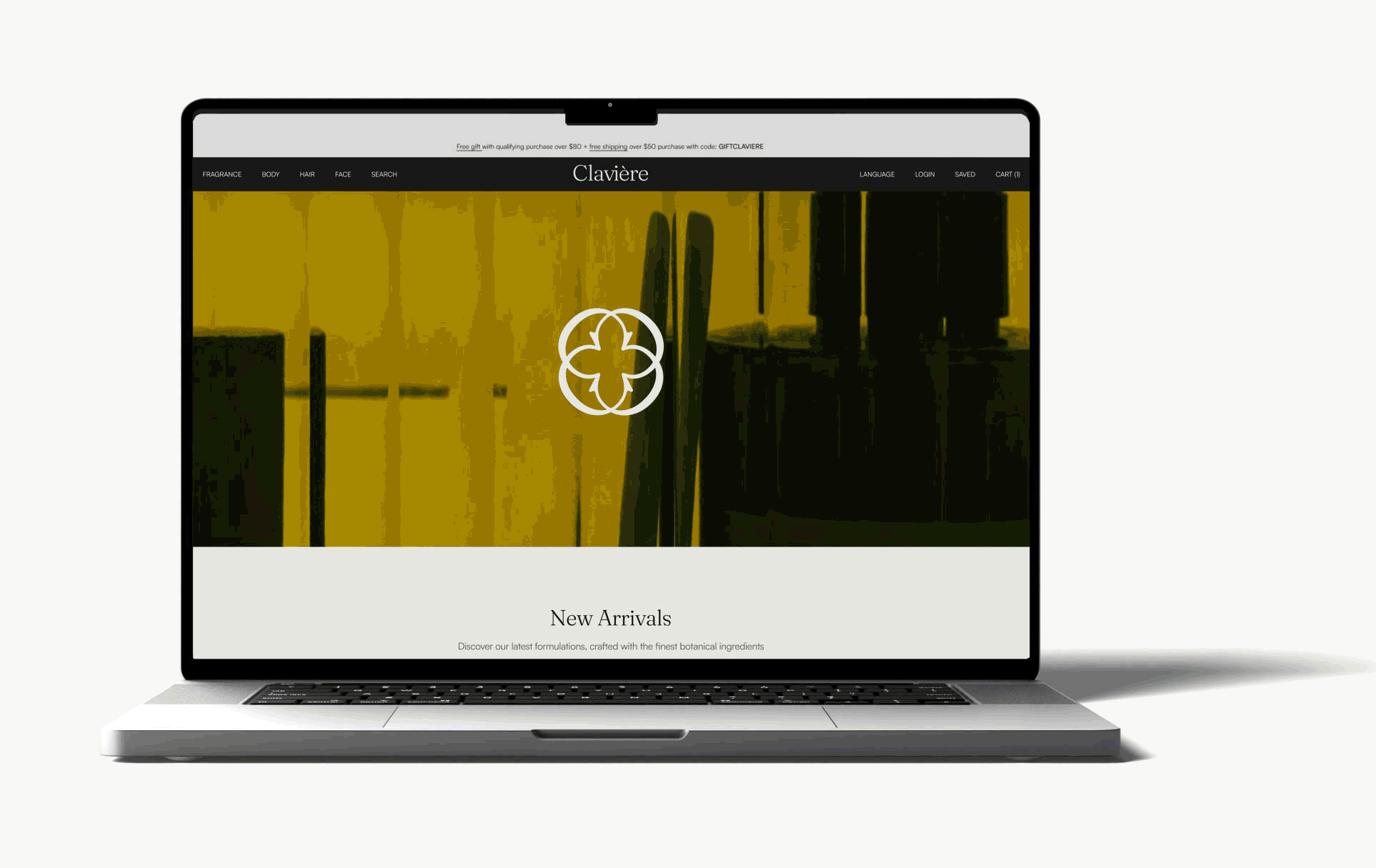
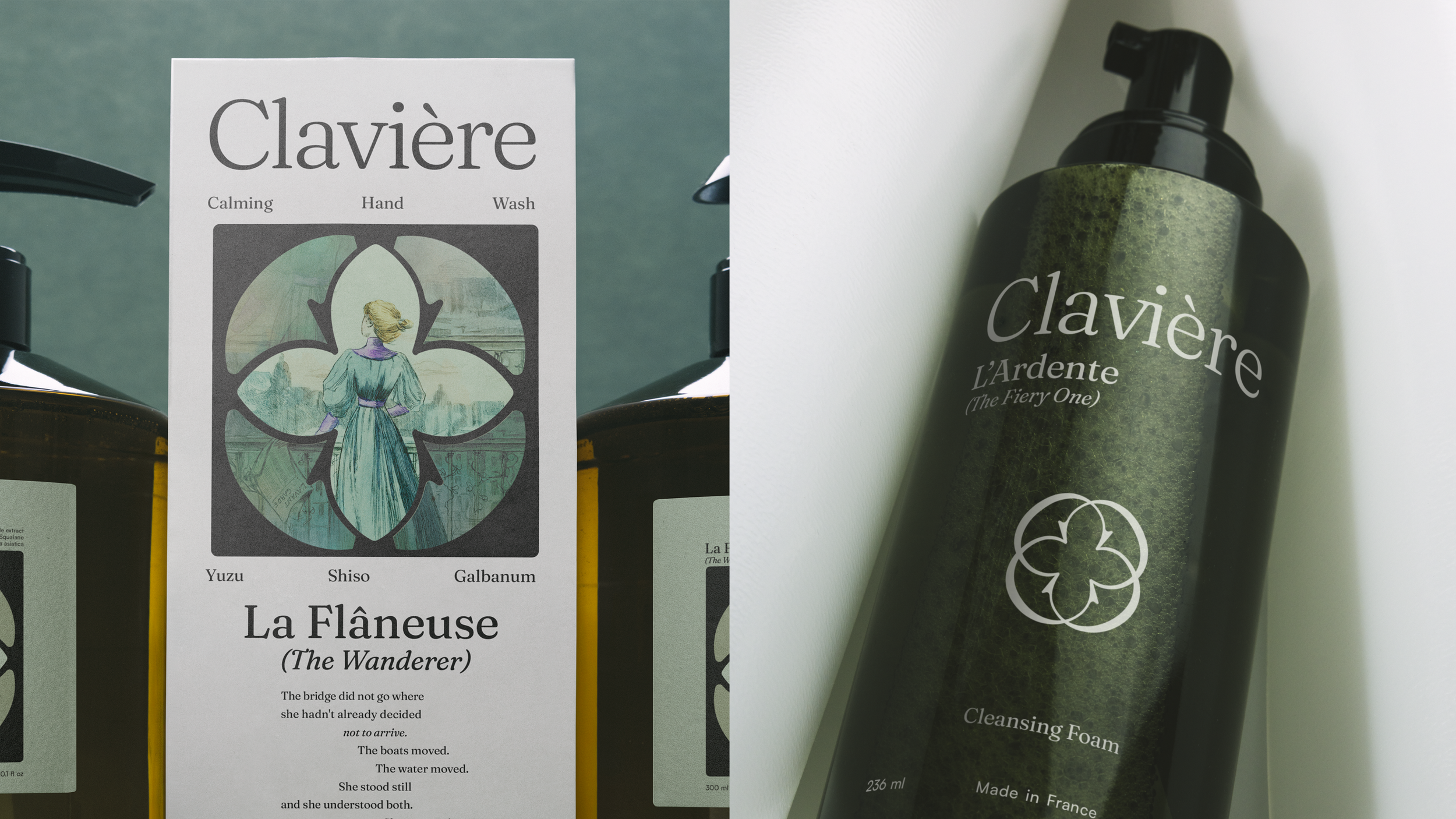
Set in Fraunces with tighter tracking. Fraunces balances heritage weight with organic warmth.
It’s soft serif terminals avoid the stiffness of most display serifs while maintaining the authority the positioning requires.
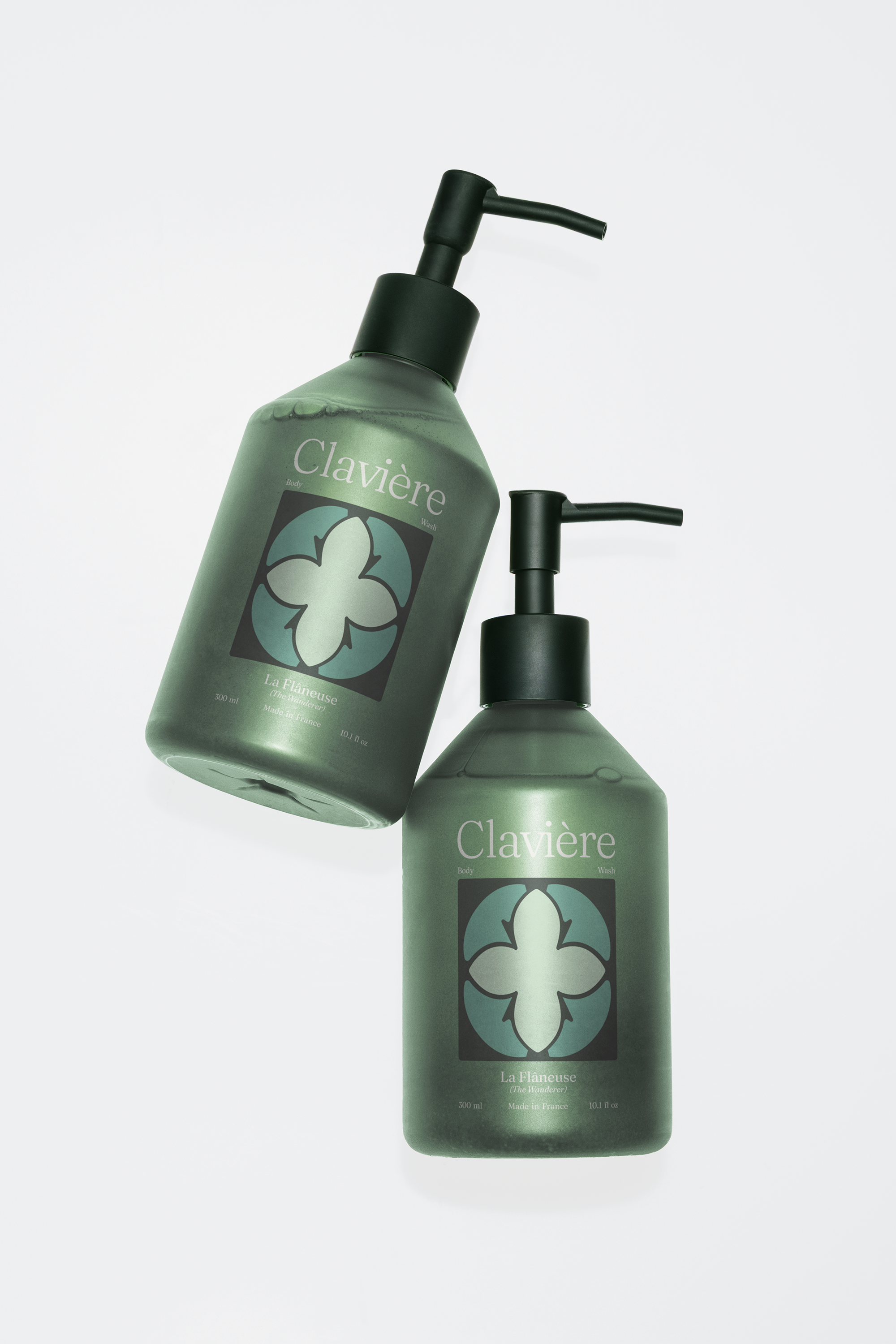
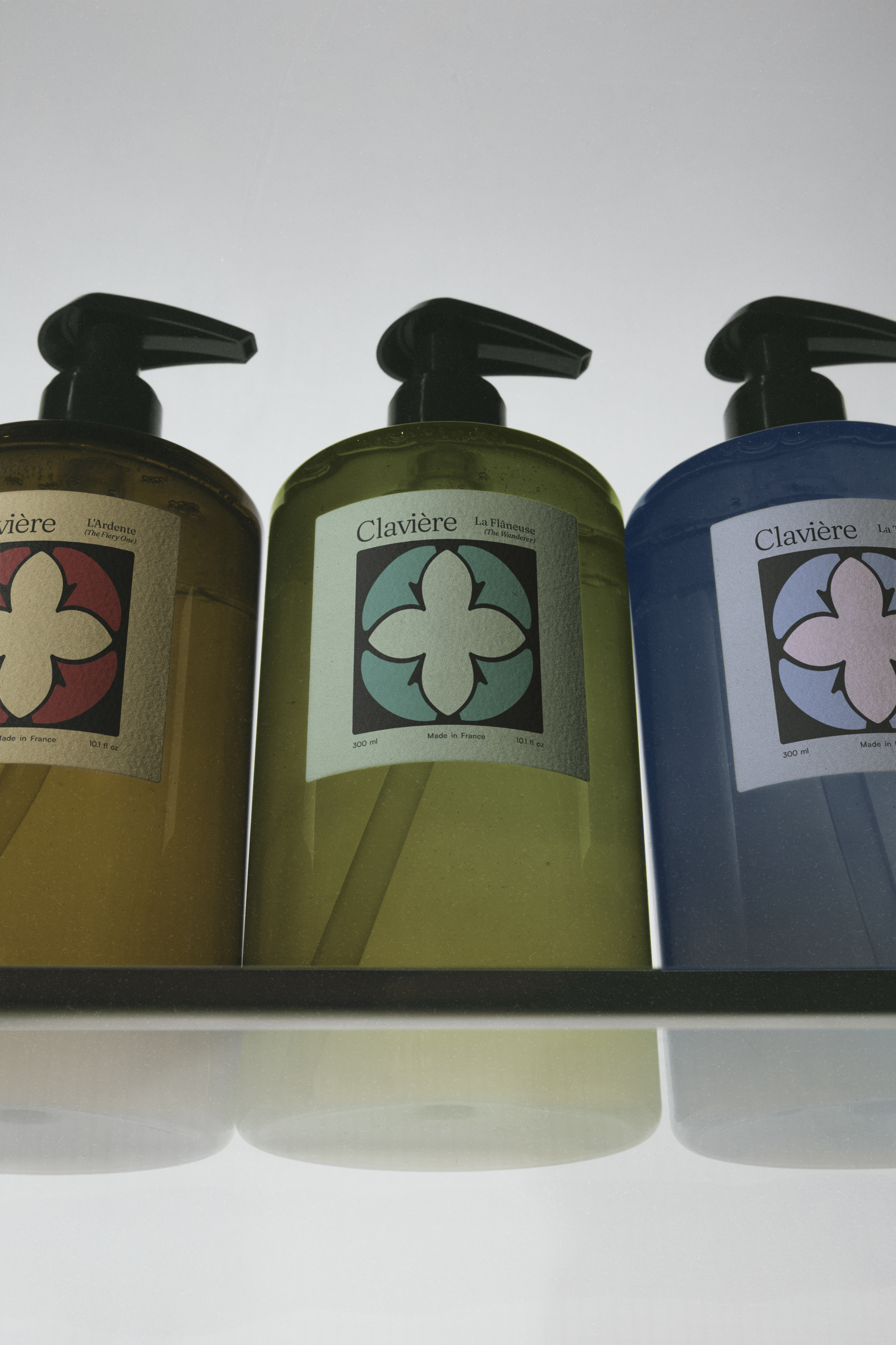
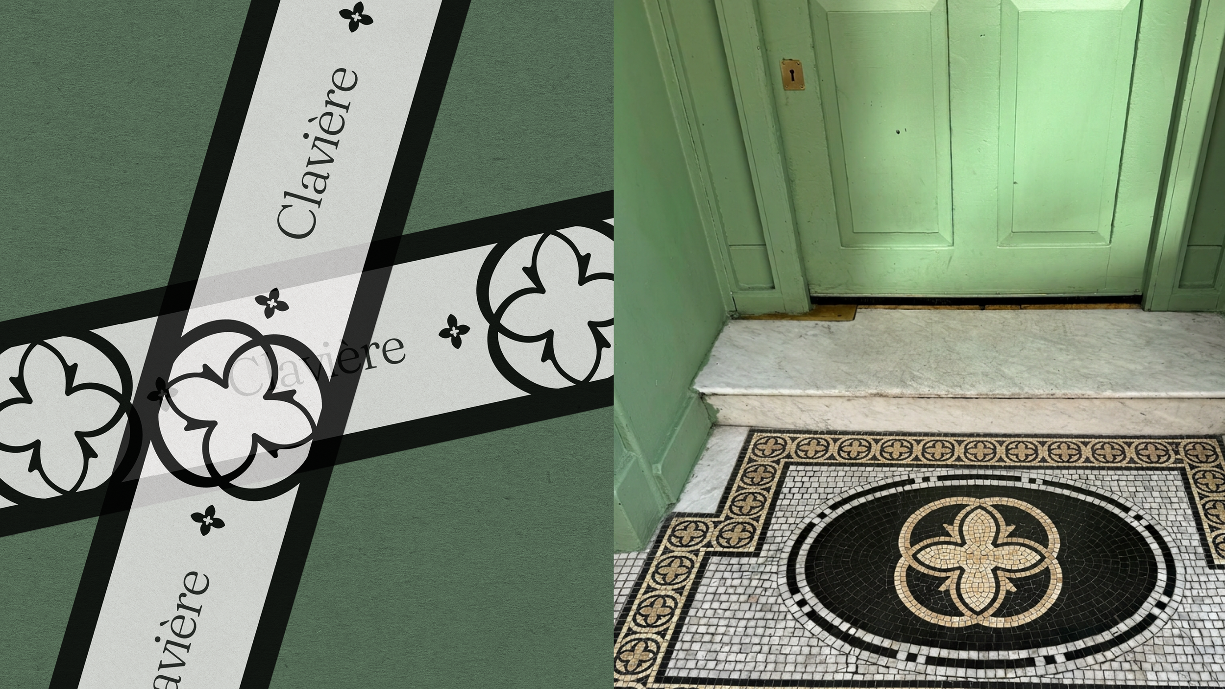
Four mirrored C letterforms arranged in a quatrefoil, a form rooted in French decorative arts and Gothic architectural ornament.
Four petals reference four scent lines. Circular containment references the daily cycle. The C forms derive from the wordmark's serif terminals.

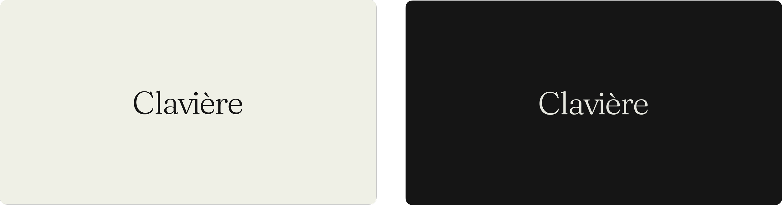
TYPE
Display: Fraunces Carries the wordmark, scent line names, and editorial headlines. Variable "old style" axis allows organic settings for editorial while keeping the wordmark structured.
Body: Satoshi Variable Handles information-heavy copy, back-label copy, and body text. Geometric with enough humanist warmth to avoid feeling too clinical.
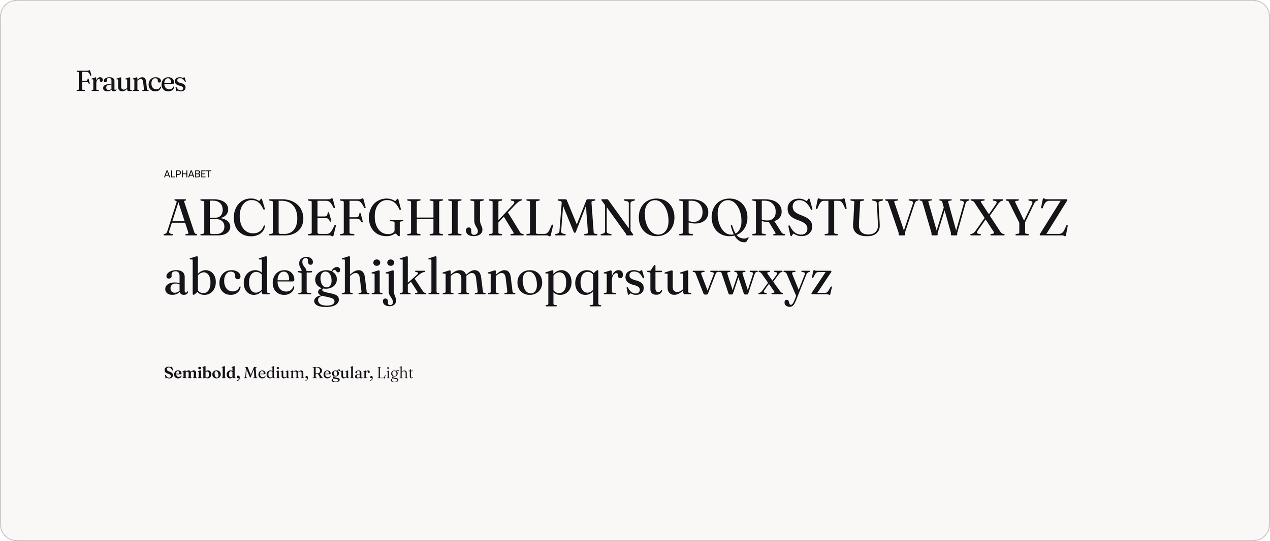
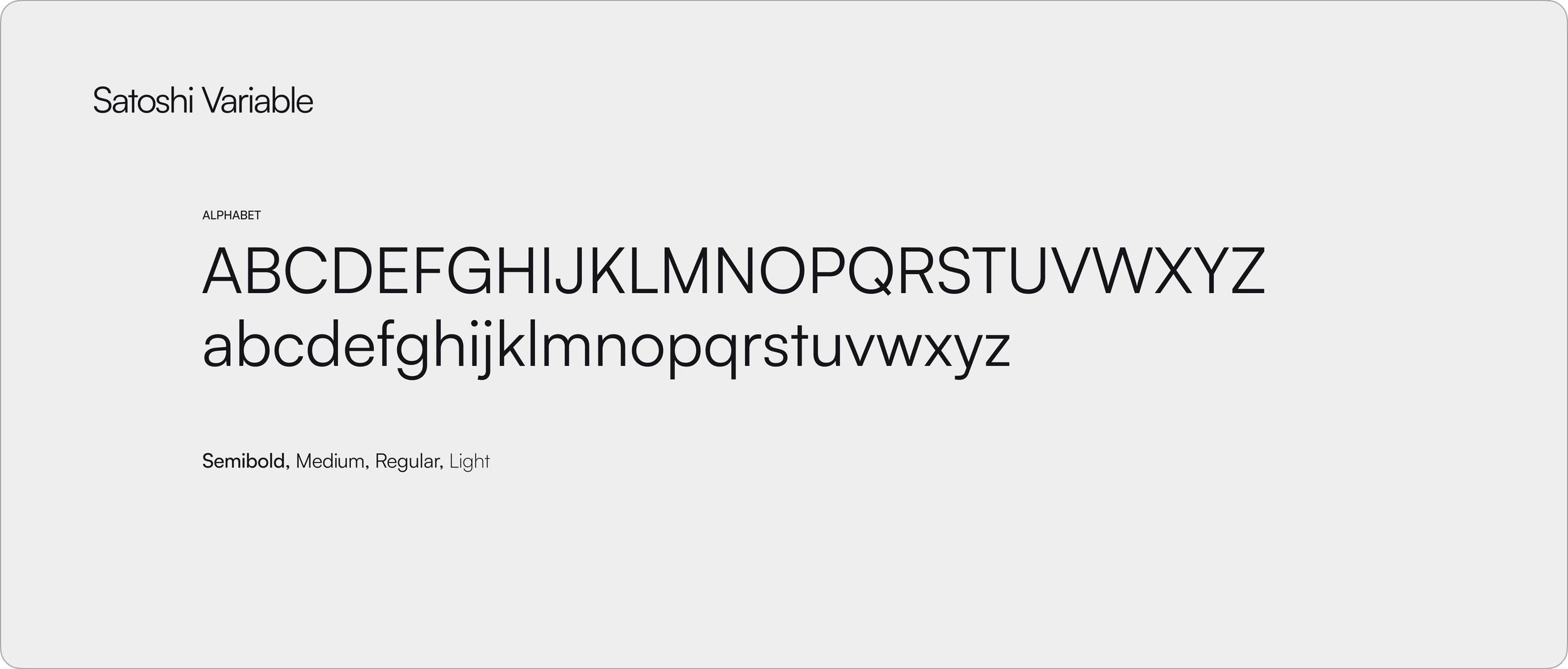
The hierarchy: Fraunces speaks, Satoshi informs.
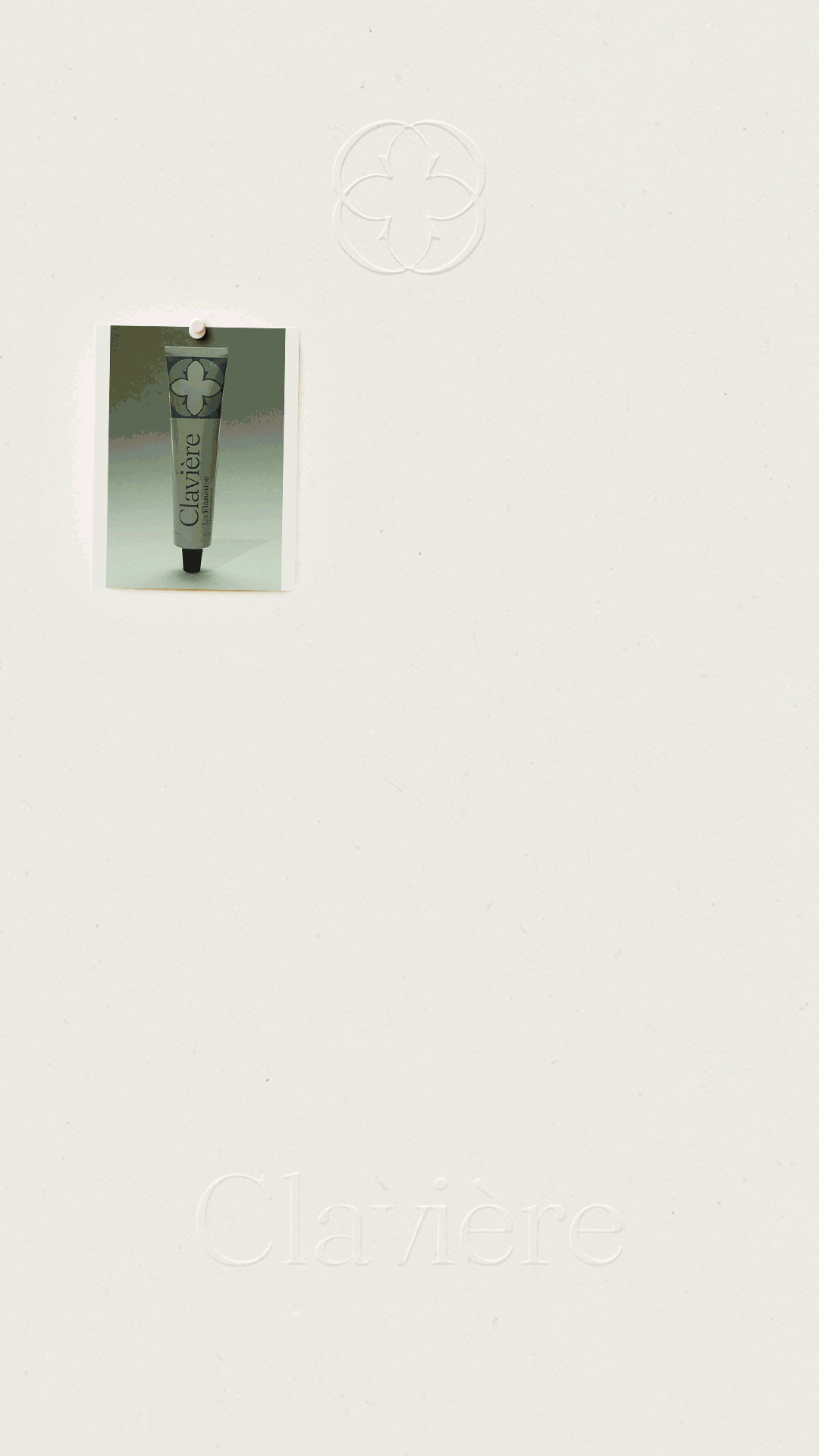
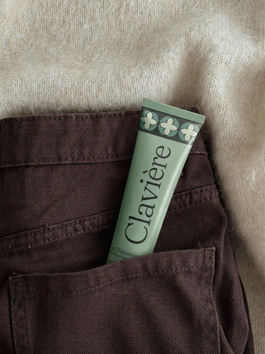
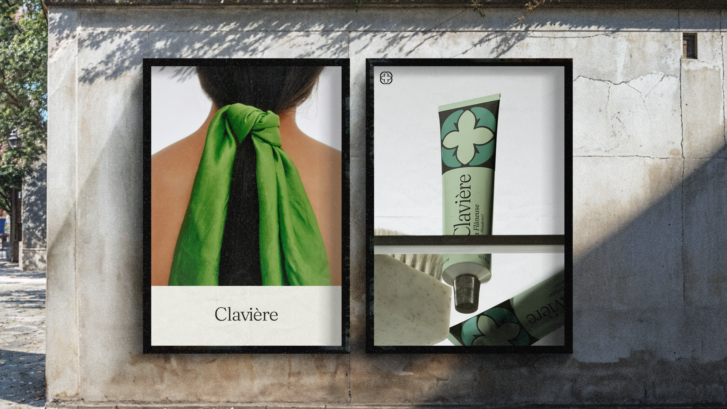
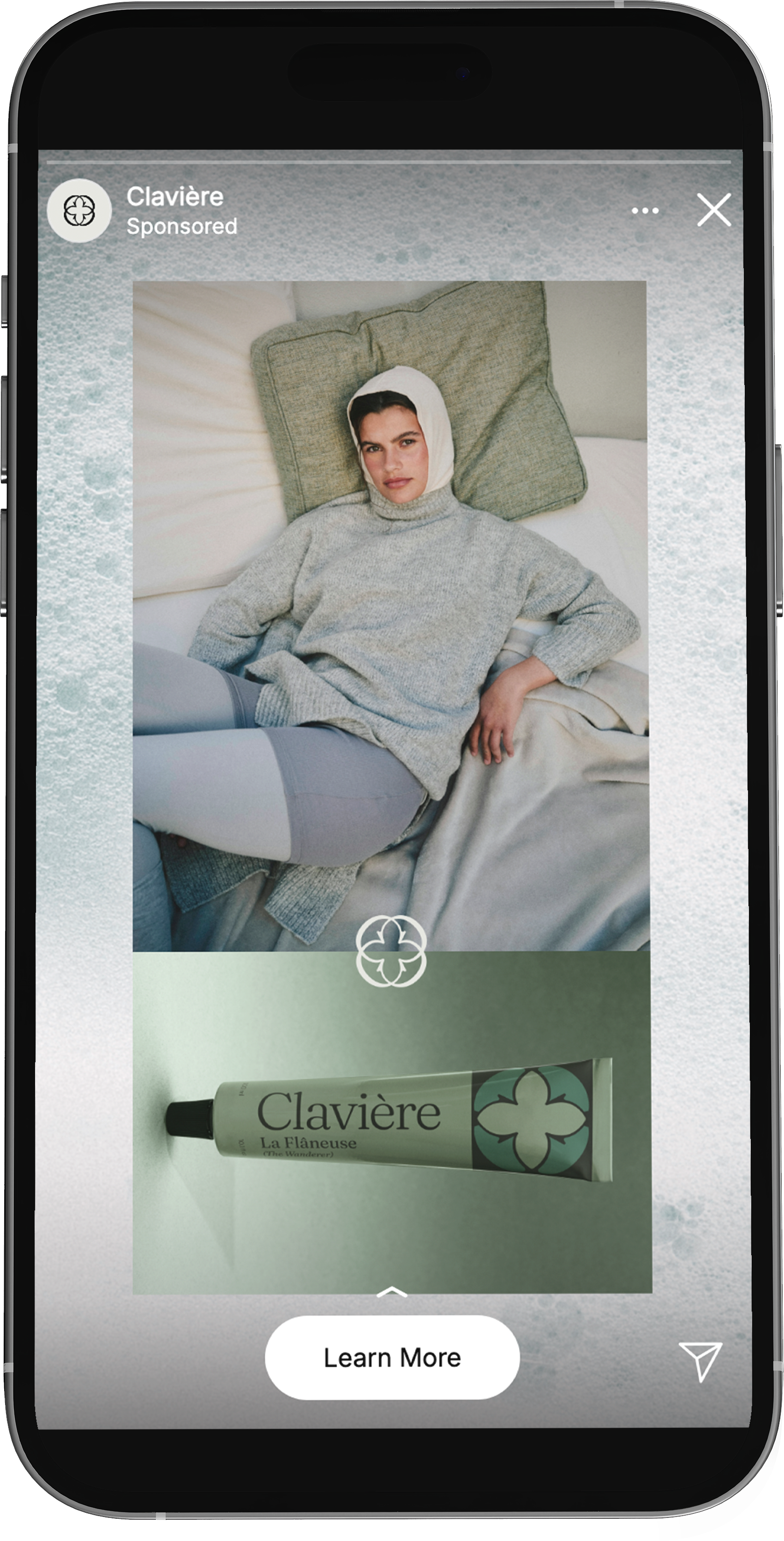
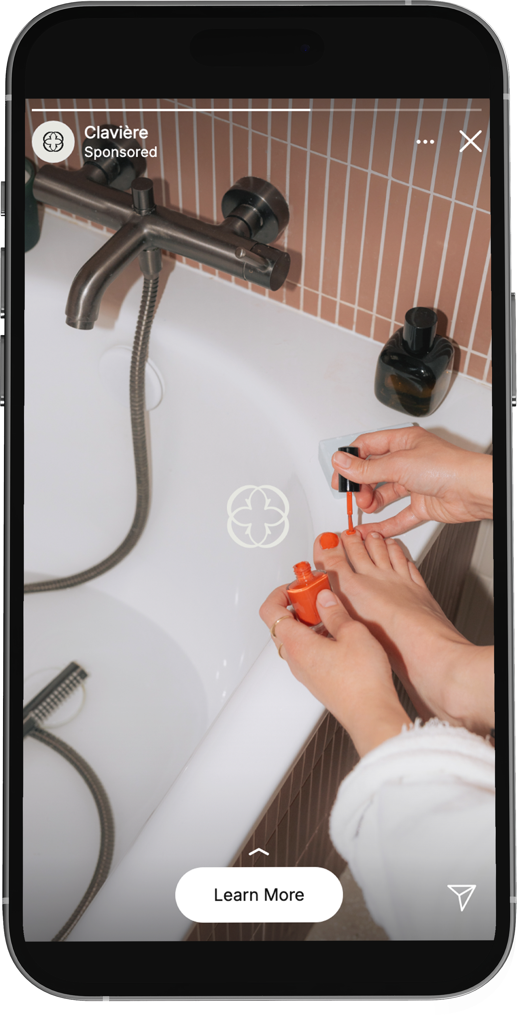
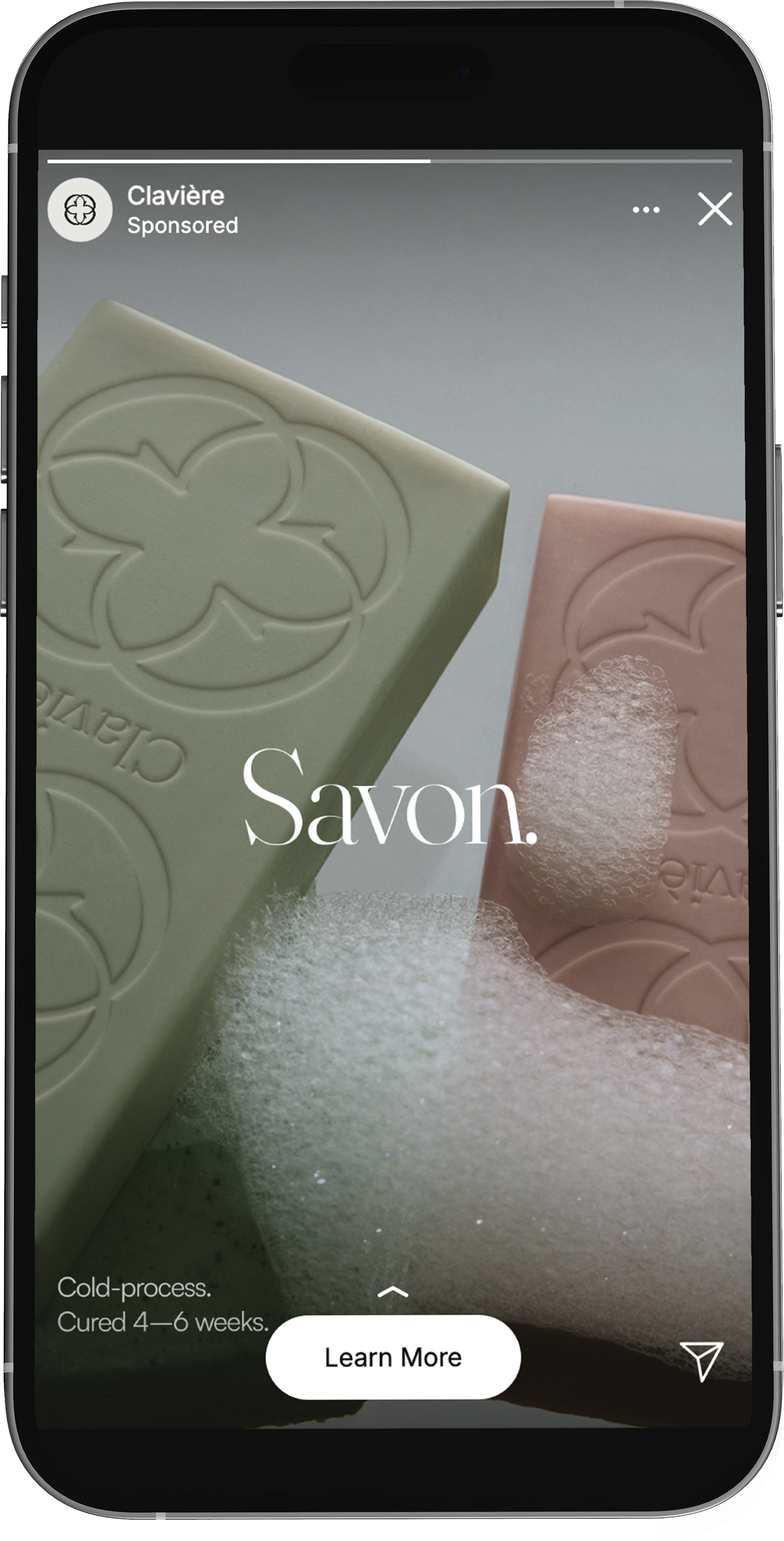
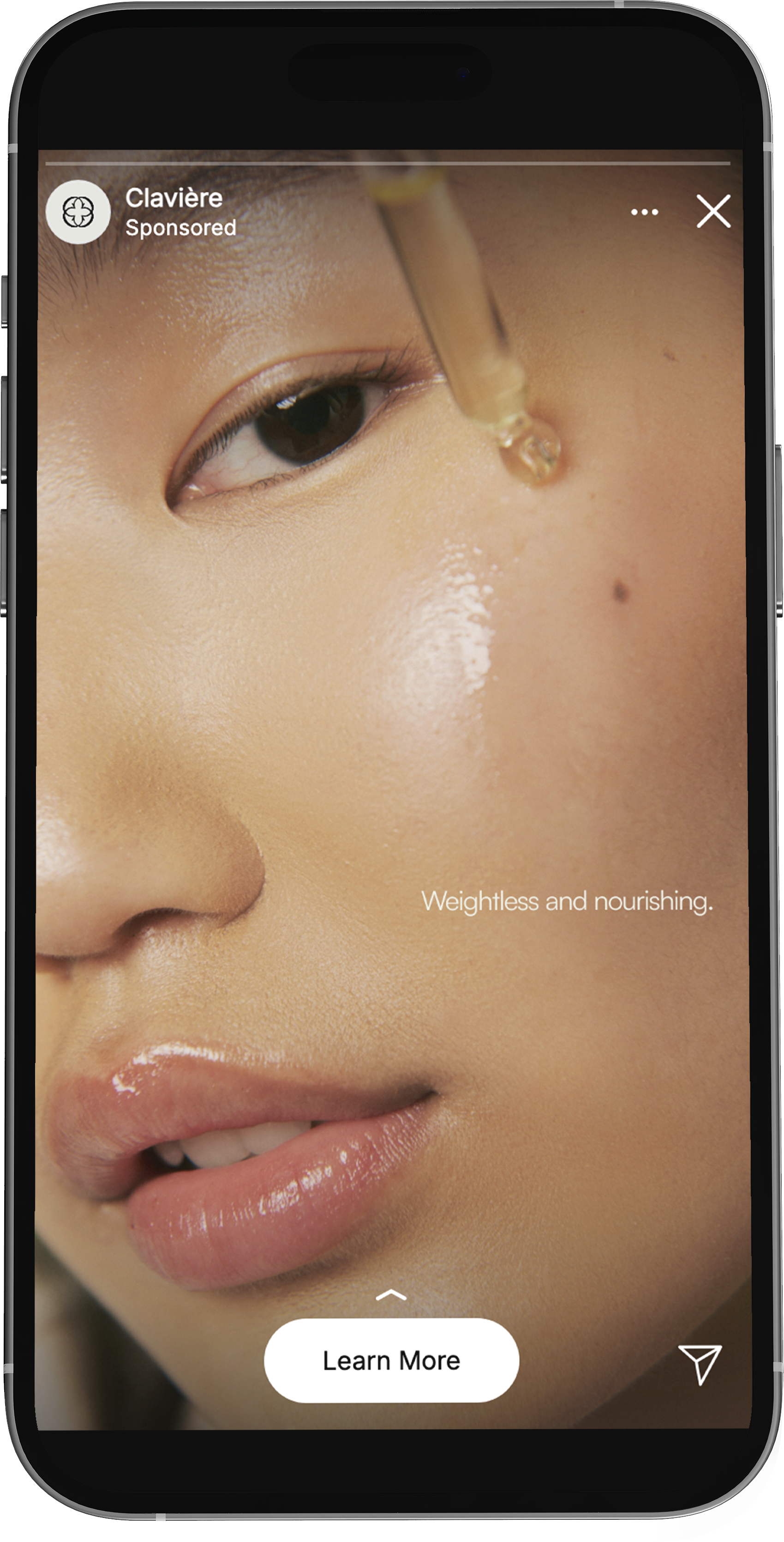
IG STORIES & PROFILE
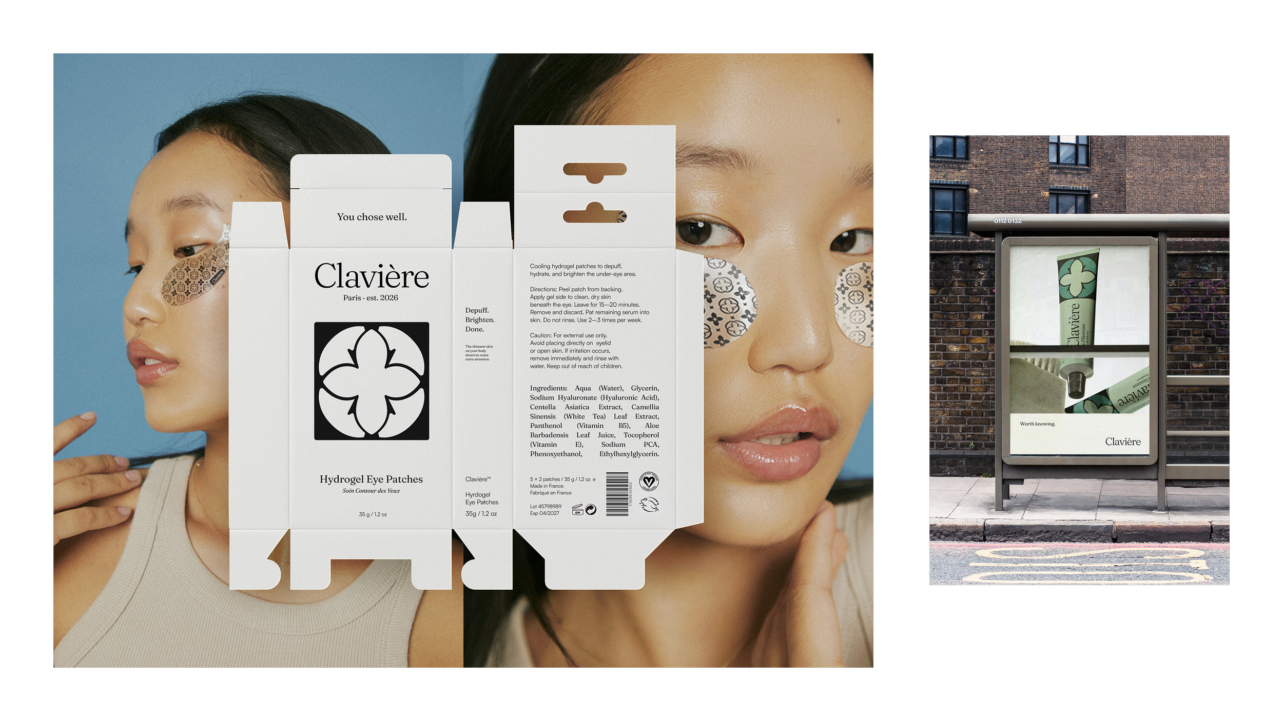
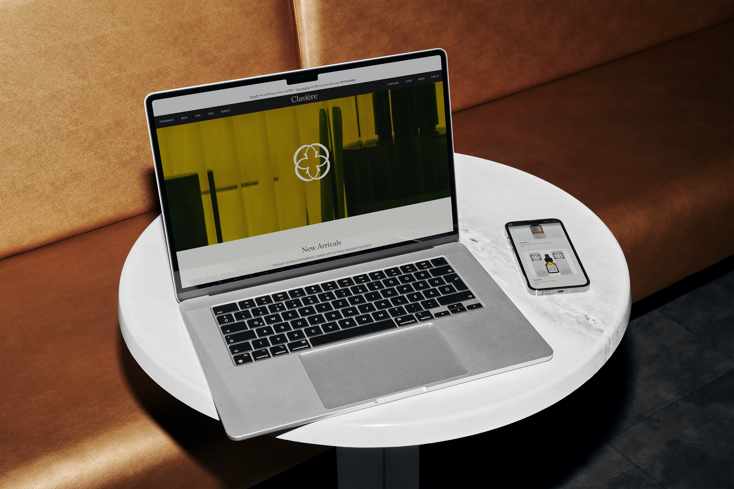
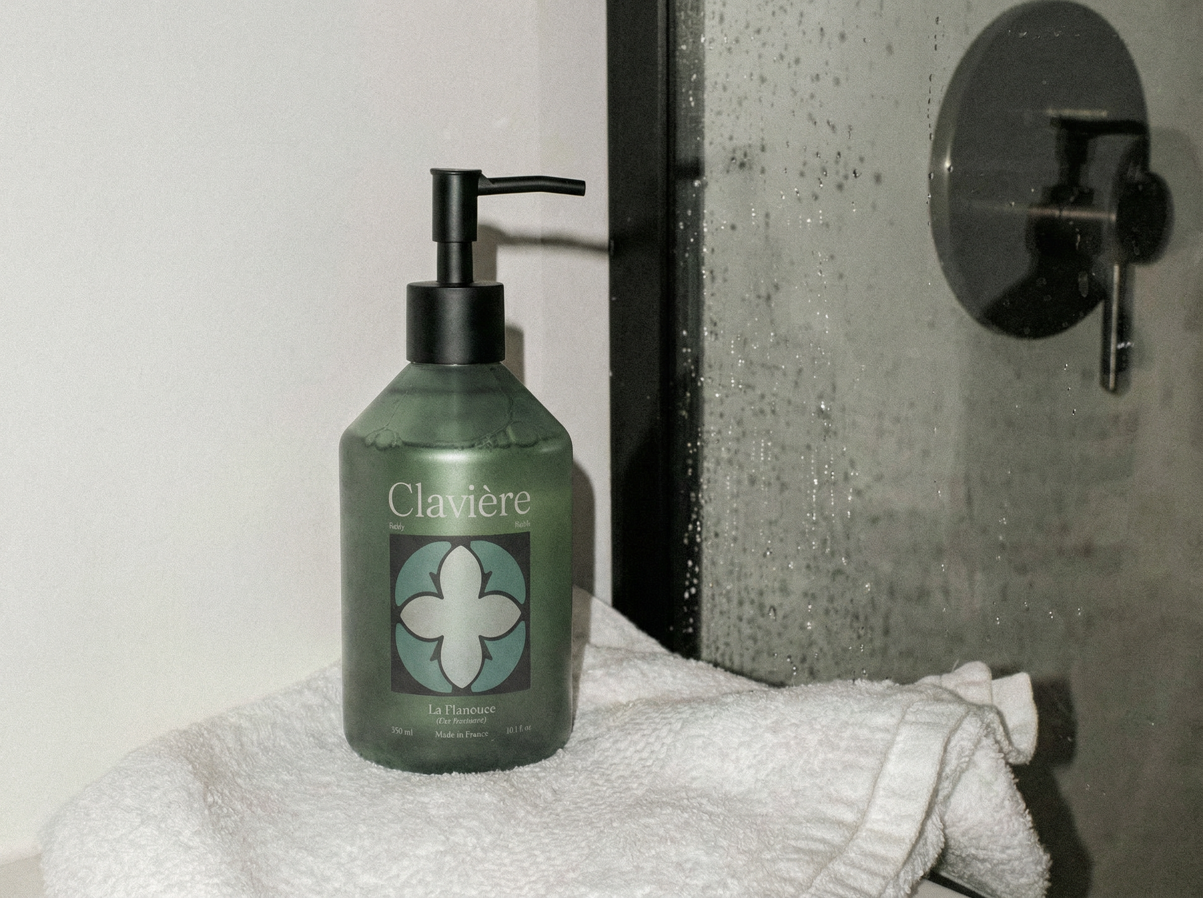
PRODUCT SITE